Studio – Final Artwork for Assessment

STORY
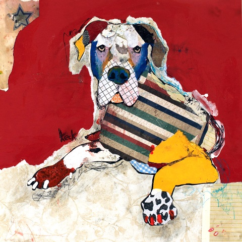
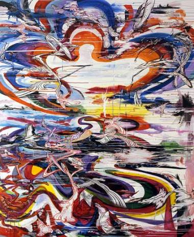
The greatest impact on my life was the loss of my beloved Staffordshire Terrier dog, Lady, euthanasied on Boxing Day 2010. Hence, Lady Love was created to depict this time. Another major event, impacting people on the other side of the world, was a snow blizzard in the east of America. This event caused deaths, major disruption and pain to lives, comparable to my experience at the same time. Accordingly, this has been depicted in Boxing Day Blizzard.

INFLUENCES
The influences to my work were the artists Cy Twombly, Jackson Pollock, Thierry Bisch and Michel Keck. Bisch produced a series of work on pop art animals, being the inspiration for my work, Lady Love. I used vivid colours and carried them through to the Boxing Day Blizzard, to enable them to be perceived as a set.

I was drawn to using text in my work, similar to Twombly. Whilst Twombly used the poetry of Stephane Mallarme, I felt an affiliation with the Lighthouse Families song, “High”. It had always represented my relationship with Lady and continues to make me sad today. Surprisingly, the song contained verses that had meaning to both works.

Next, Kleck’s use of cut out letters was my inspiration to display the verses. And, in the application of paint in Boxing Day Blizzard, Pollock’s “action painting” technique was my motivation.

MATERIALS
In creating the imagery for both works, I used acrylic paint and photocopied text. I used photographs to get imagery. In Lady Love I used the computer to manipulate colours, adjusting the saturation and hue until I had a picture that didn’t appear real life. I then cropped the image, selecting a portion, to give an abstract effect.

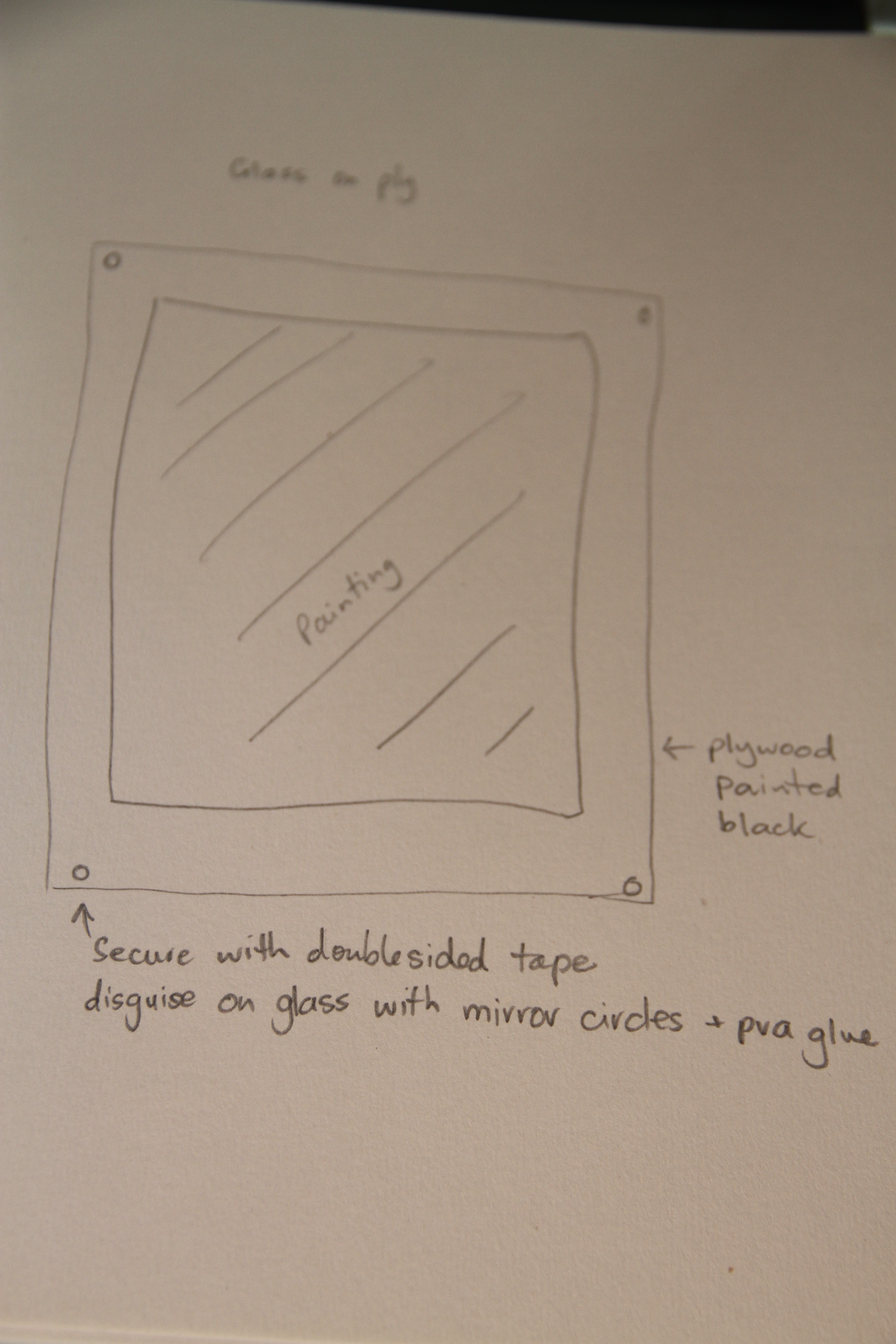
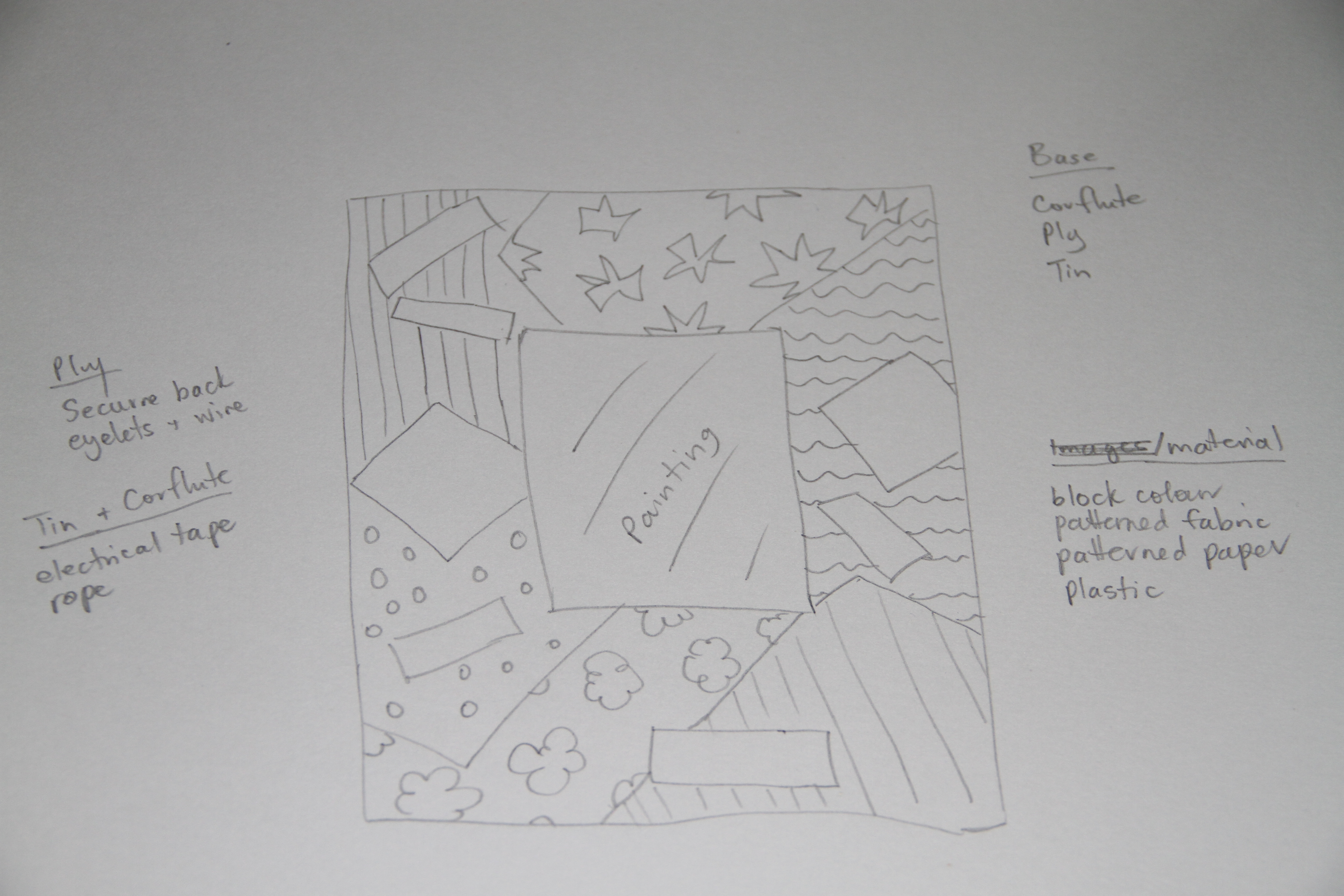
Boxing Day Blizzard required thin paint to manipulate into the appearance of snow. I also used the thinned paint to dab on the work for the appearance of a mottled, angry sky. Then, again, rolling the brush between my palms at the right, top, corner of the painting to create droplets. This would enable the picture to look as though the snow was blowing, being that it needed to represent a blizzard. The installation for my paintings incorporated mounting the picture on corflute and then attaching the mount to a larger corflute base. The base was then collaged using fabric and paper.

LEARNING
I have learnt from my work that I can actually paint, something in which I had always believed that I was unable to do. Further, I have realised that I am more creative than I have previously believed, with my abstract being both surprising and pleasing. Until summing up my artwork I had not identified that I had been inspired by the work of so many people, looking back upon the artists that I have reviewed it is evident where I have drawn my ideas. What is more, of all the skills that I have developed in the course of my studies, the technique of colaging has had the great bearing on me. This is a technique that I have never practiced before but will continue to master in my spare time due to it being able to tell a story in so many different ways.

IMAGES
final work installed
Final Artwork installed

hanging
Installation view

parta_full
Lady Love

parta_4
Text from Lady Love

parta_5
Portion demonstrating painting technique of Lady Love

parta_3
Frame from Lady love

partb_full
Boxing Day Blizzard

IMG_0025
section_b
Text from Boxing Day Blizzard

IMG_0028
Portion demonstrating painting technique of Boxing Day Blizzard

partb_4
Frame from Boxing Day Blizzard

Studio – Installation

1. The installation process that I undertook with my artwork was colaging a frame. This involved purchasing two pieces of corflute. I chose the blue colour corflute to complement the existing colours in my paintings.

2. I then purchased and collected a variety of material to use in the colaging, including printed paper, ribbons, and photocopied pages.
material collage

3. I trimmed the corflute down to a size that provided sufficient space for a border, without detracting from the painting.
IMG_9979

4. The corflute that had been removed was used as a mount. Using a graphite pencil to mark where to place the mounts, I then used PVA glue to secure to the frame.
mounting corflute (2)

5. Collage designs were considered before PVA gluing the material. Whilst both paintings used similar designs, they also both had their own individual elements. For example, Artwork A featured text, such as “soulmate” and butterflies that represented Lady’s gentle nature. Artwork B incorporated snippets about Christmas sales and incorporated Christmas decoration. Further, silver textured cardboard was used as an immediate frame around each painting which gave a feel of corrugated iron, and defining the painting and the collage work.
IMG_9976

6. Upon colaging and securing the mounts I then secured in place the paintings. The paintings had to be waited down for approximately two hours to ensure they were dry and locked in.
weighing material
7. As the work was of light weight, I used electrical tape and rope on the back to enable the paintings to be hung.

Studio – Installation Considerations

Great consideration was given to the installation of my artwork. Initially I had thought to place the artwork behind glass, with similar effect to Gerhard Richter’s Venice series. However, I felt this would change the way in which my paintings are read, being they would be seen as disinteresting and formal.
instl glass

I then considered using a wooden ply background, painted white or black, then placing mirror pieces around the work. I felt this would represent ‘brokenness’, with the mirrors reflecting the view today. However, I also felt this would potentially detract from the painting not enhance it.
instl mirror

Then, I considered doing a display, like that of Katharina Grosse’s Pigmentos Para Plantas y Globos. I thought to use an object in my display to compliment the work which I would not hang but lean against the wall on a shelf with display items in the foreground. I decided against this as I was unable to decide upon objects to tell a story about both works. Further, I did not want to confuse the messages in my work.
display

I then decided to produce installation using colaging, being a technique in which I have a desire to experiment with further. I felt that colaging would contribute to my paintings. It would enable me to continue to tell my story and create a greater connection between the two works.
instl collage 1

Studio – Installation – Baroque, Michael Kvium and Katharina Grosse

When considering architects simultaneously with painters and ceilings of churches I can’t help but think of Michelangelo di Lodovico Buonarroti Simoni. I have been very fortunate in my life to have seen the Sistine Chapel, being a dream of mine, and my very first trip overseas. I spent many hours in the chapel appreciating the painting with little consideration to the architecture of the building. Now looking at the relationship between artists and architects in greater detail, in particular the Baroque period, I see that chiaroscuro and rich interiors were of importance, along with use of spaces and art. Architects such as Sir Christopher Wren producing such Baroque infrastructure as England’s St Paul’s Cathedral.

st-pauls-tickets-02
St Pauls Cathedral exterior

St-Pauls-Cathedral
St Pauls Cathedral exterior 

Michael Kvium and Katharina Grosse have both been researched in relation to their installation practices. Kvium is understood to have created an exhibition of approximately 1500 square metres, consisting of 100 works, and dating from 1984, called Jaywalking Eyes. The display took the viewer on journey which is described to be somber and horrifying, with Kvium being described as being “…fascinated by the kaleidoscopic, schizoid and many-facetted picture of the world that is characteristic of insanity” (Art News 2006).

Grosse is understood to use large spaces to display her art. For example, her One Floor Up More Highly (2011) installation, in which she claims the “inside and outside coexist” (Maier,

One floor up more highly, 2011
One Floor Up More Highly – Katharina Grosse

jaywalking Eyes
Jaywalking Eyes – Michael Kvium

Studies – Task – 4 point response to memory

Write a four-point response to the following quotes:


Memories link us to place, to time, and to nation: they enable us to place value on our individual and our social experiences, and they enable us to     inhabit our own country. Shared memories can provide a social cohesion – but they are also a source of great conflict.

K. Darian-Smith & P.Hamilton. Introduction to, Memory & History in Twentieth-Century Australia. Ed. K.Darian-Smith & P.Hamilton. Oxford University Press, 1994. p1.


Firstly, events that create memories may result in a cohesive or conflicting perception depending on the individual.  For example, I am forever linked with the Northern Territory, with memories bringing both a sense of belonging and also conflict.  Until 18 months ago I had lived my entire life in the Northern Territory.  I now live in South Australia.  The Territory is a place that I have memories of, both good and bad.  Having grown up all my life in the Territory I have watched the place change and small cultural Territorian elements have become lost or modified.  Whilst my memories provide cohesion with others of my era that feel the same way about some of the changes as I do, it is also a source of conflict for others that see the changes as being necessary and positive.  Hence, what we experience and the way it is stored as a memory can be both cohesive and conflicting depending on the individual.

Secondly, a shared memory may be perceived differently, depending on circumstances.  For example, I have a memory of my grandparents, and the stories they shared on their memories of my great‑grandparents migration to Australia.  My great-grandparents are from Wales, Malta and England, and I am third generation Australian.  Whilst my memories of Australia are that this is my home where I was born, and my ancestors where European and British, Indigenous Australians may consider me as being an invader and being foreign.  So, again, memories shared from generations create different perceptions and bring both cohesion and division.

Thirdly, memories linking us to a time, place, and nation create pride that is both accepted and unaccepted in the wider community.  As an Australian, when I have gone abroad, I have found myself to be favoured by Americans and British fellow travelers.  This rapport is likely influenced by the Australian government’s on-going support to alliances in historical world events.  Having memories of Australia contributing positively in world affairs makes me proud of my country.  However, these same historical events and long lasting inter-country relationships may be perceived by some as being unacceptable, and consequently, an essential source of conflict.

Finally, through shared memories changes may be implemented that bring both conflict and social cohesion.  For example, for most of my life I have lived in Darwin, however for a period of seven years I lived in Alice Springs with my family.  I thought Alice Springs was exceptionally beautiful with the red rocks of the McDonnell Ranges bordering the township.  I also had a great circle of friends, a busy social lifestyle and a wonderful work environment.  Nonetheless, internally I was battling with the desire to return to Darwin with memories recalling the place as being my true home.  Consequently, sharing these memories with my family of what we had when we lived in Darwin, and what we could do if we moved back there, brought conflict which resulted in cohesion upon eventually returning to the Top End.

Artists – collage: Michel Keck and Derek Gore

Derek Gores
Unknown – Derek Gore

Derek Gores
Uknown – Derek Gore

great dane - Michel Keck
Great Dane _ michel Keck

west highland terrier - Michel Keck
West Highland Terrier – Michel Keck

Two artists that I have reviewed due to their incredible skill in using collage are Michel Keck and Derek Gores. I chose these two artists as I find their work distinctly different to each other, but both artists are particularly appealing to me.

Keck uses a technique in her work called “giclee”, a method in which an inkjet printer is used to print her artwork on canvas. Keck’s work can be quite complex, filling the entire canvas with collage material, such as Balancing Act or When Angels Hit the Snooze Button. The latter artwork I found to be clever, being that it is Eve in front of the apple tree, however wittily named as to not give away much. Her series on dogs are truly incredible. In this she uses collage pieces with unusual prints or block colour, rather than words. I find this entire series inspirational.

Similarly, Derek Gore uses collage extensively to create a story using labels, digital material and magazines on canvas. He uses material of a particular colour to create depth in his imagery, and words that compliment his subject. For example, in his picture of a boy he uses words such as “happy”, “inspire” and “play”. In his work which of a basketball player, assumed to be Magic Johnson, Gore uses photographs of Magic as part of his collage. In my personal opinion, his work can be described using one word… “phenomenal”.

Task 2 – Objective and subjective

The images that I have chosen to discuss are Study of a Wild Dog by Andrew Wyeth, Open Paths of Origin by Suling Wang, Not to be touched by Nicolas Carone and Phil by Chuck Close.

Images titled “Phil” and ” Study of a Wild Dog” are both objective in nature.  Objective, being that the image is depicted in a realistic manner.  A great quote on objective art that I located in Anna Challenger’s “Philosophy and art in Gurdjieff’s Beelzebub: a modern Sufi odyssey” (2002, p32), was that “the impression of such art on those that experience it is always definite”.  And, although the artists use different techniques to produce the work, both paintings produce realism which may be clearly interpreted by the viewer.  For example, in the artwork titled Phil, Close drew a grid over a photograph of his friend Phil.  A painting was produced on a canvas by segmenting each square and painting individually.  In Study of a dog, Wyeth painted directly on canvas, using rough brush strokes to give an effect of scruffy wolf coat.  It is obvious to the viewer that Phil is an image of a person’s face and that Study of a dog is indeed a dog.  Both works, in my opinion, are equally appealing although vastly different.

On the other hand, subjective art may be defined as an artist’s interpretation.  This may lead to the object being distorted, such as in Wang’s Open Paths of Origins and Carone’s Not to be touched.  Both paintings are open to guesswork with no readily identified story.  Wang’s artwork is complex in colour and content, whereas Carone is less busy and using two colours.  Neither of the works provide clarity to the viewer, only complexity.  In my personal opinion, I prefer to view subjective art, and I appreciate subjective art more than objective art.  This is my personal likes and dislikes.  Part of the reason I prefer subjective art is that I can identify what I am viewing and appreciate how the artist has conveyed that message to me.


Study of a Wild Dog by Andrew Wyeth

a_wyeth_study_of_wild_dog

Open Paths of Origin by Suling Wang

open paths of origin

Not to be touched by Nicolas Carone

not to be touched

Phil by Chuck Close.

phil

References


Challenger A 2002, Philosophy and art in Gurdjieff’s Beelzebub: a modern Sufi odyssey, p32

http://books.google.com.au


Set 2 – Ideas and execution

My focus in this painting was to produce work that depicted a world event, but complimented my Set One: It’s all about me work.  After much research I decided upon producing a painting that portrayed a blizzard, or a snow storm, in America.  I chose a blizzard as it had a huge impact on the community in the East of the continent.  The blizzard of Boxing Day 2010 disabled a number of states, closing down public transport, and destroying infrastructure and lives.  Ultimately impacting members of the community as much as my personal event on the very same day, on the opposite side of the world.  It was also an event that we do not have in Australia and therefore struck my curiosity.

After reviewing days and days of pictures and video footage, I selected a photograph which I found to be interesting.  It featured people undertaking their daily duties, and walking in the city, presumably to or from work.  I cropped the photograph until it was only a portion of the former.  I then used a graphite pencil to draw the image on the paper.  Then, mixing carbon black with titanium white and Flow Medium, I achieved a thinned medium grey.  I used this to paint the sky.  I used a thinner consistency and applied the paintbrush to the paper in dabs, in aim to give the effect of a mottled and angry sky.

I then again used the carbon black with titanium white to achieve a pale grey.  This was to be used on the ground to depict snow.  The figures I painted in cobalt black as through earlier experimentation with the silhouette figures I liked the result.  It produced a figure that was interesting yet did not draw away from the real message of the painting.

In sectioning the umbrellas, I used vermilion with titanium white, and also cobalt with titanium white.  I chose to use the same colours as in Set One as I wanted the pictures to have a linkage to each other.

In depicting the snow falling I thinned some titanium white and applied to my brush.  In an earlier experimentation I had attempted to do dripping across my paper, similar to that of Jackson Pollock.  Unfortunately I had been dissatisfied with my result.  I also attempted to flick my brush but again was not content with the result.  I recognised that placing the brush in the palms of my hand and rolling it would splatter the paint in small droplets that would be effective in representing snowflakes.  This was the method that I used.

Again, in linking this painting with Set One, and using Twombly as inspiration, I used a line from the same song used in Set One, Lighthouse Family’s song “High”. The song featured several lines that would sit beautifully within the painting.  As with my earlier artwork, I felt that symmetrical type would appear better on the work.  I typed then printed the text, cutting out each individual letter then applying it with glue to the work.


Set 2 – Developing Ideas #5

Returning back to the imagery that showed personal impact of the blizzard through people walking within the storm, I found this image to be the most dramatic and interesting of everything that I had viewed relating to the catastrophe.  I decided upon using the image of people walking in the blizzard as the content of my artwork.  I had earlier drawn and painted a version of this work and decided to return to it and try to better it.  I had identified in earlier images that the colours were mostly black and white.  Coincidentally, this complimented lyrics in the Lighthouse Family song “High” once again:


“Though it’s darker than December
What’s ahead is a different colour”

I then changed the hue and saturation of the image, then cropped the portion of the image to be used.


snow-storm

snow-storm_edited_4

Set 2 – Developing Ideas #4

IMG_9951IMG_9899